LONG VAN GROUP
Corporate identity
Long Van Group was founded in 1992, focusing on producing premium aluminum products in Vietnam. Leveraging cutting-edge Japanese technology, they offer extensive products catering to local and global markets. The company's rapid expansion has led to its evolution into the Long Van Group, showcasing its commitment to growth and excellence.


APPROACH
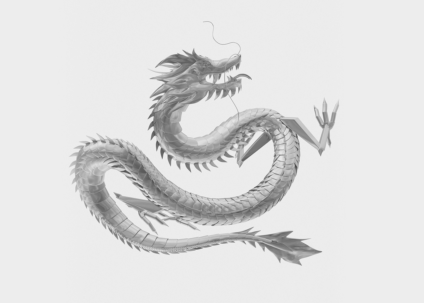
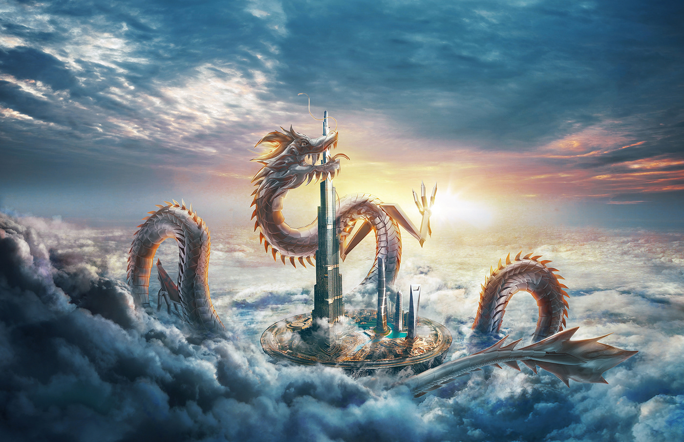
Forming a strong and clear brand identity with a strategy to reposition and restructure the group, Long Van aims to be well recognized in the market with the new brand personality. The logomark is inspired by aluminum – their main manufacturing field and the dragon – Long Van mascot. The dragon is a legendary creature with intelligence and represents the top leaders, the universe, prosperity, and non-stop business growth in Eastern beliefs.

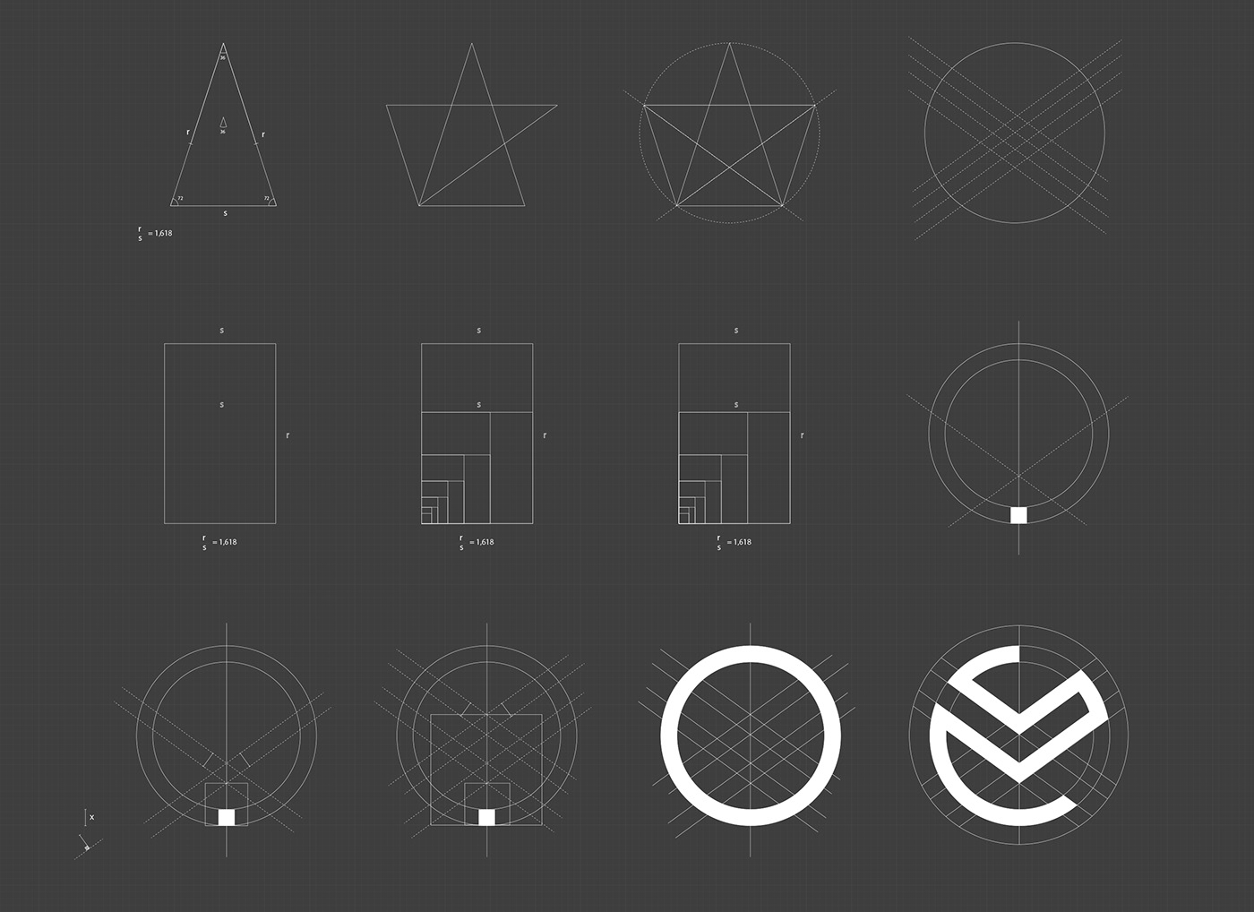
LOGO
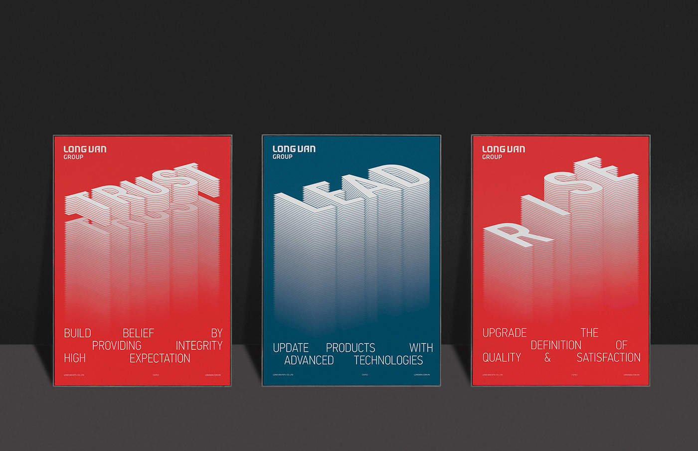
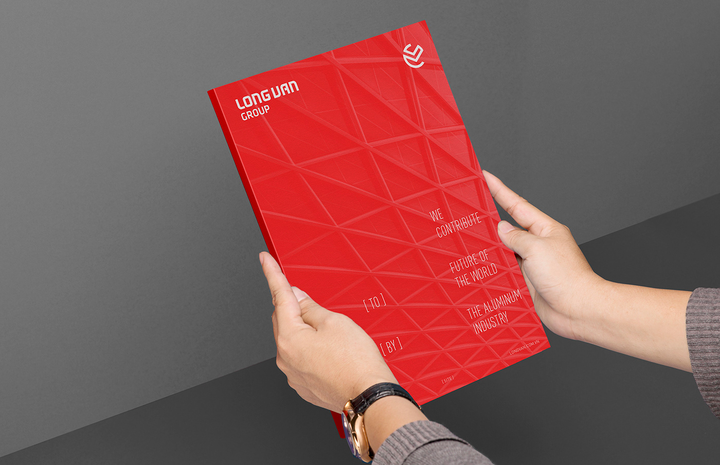
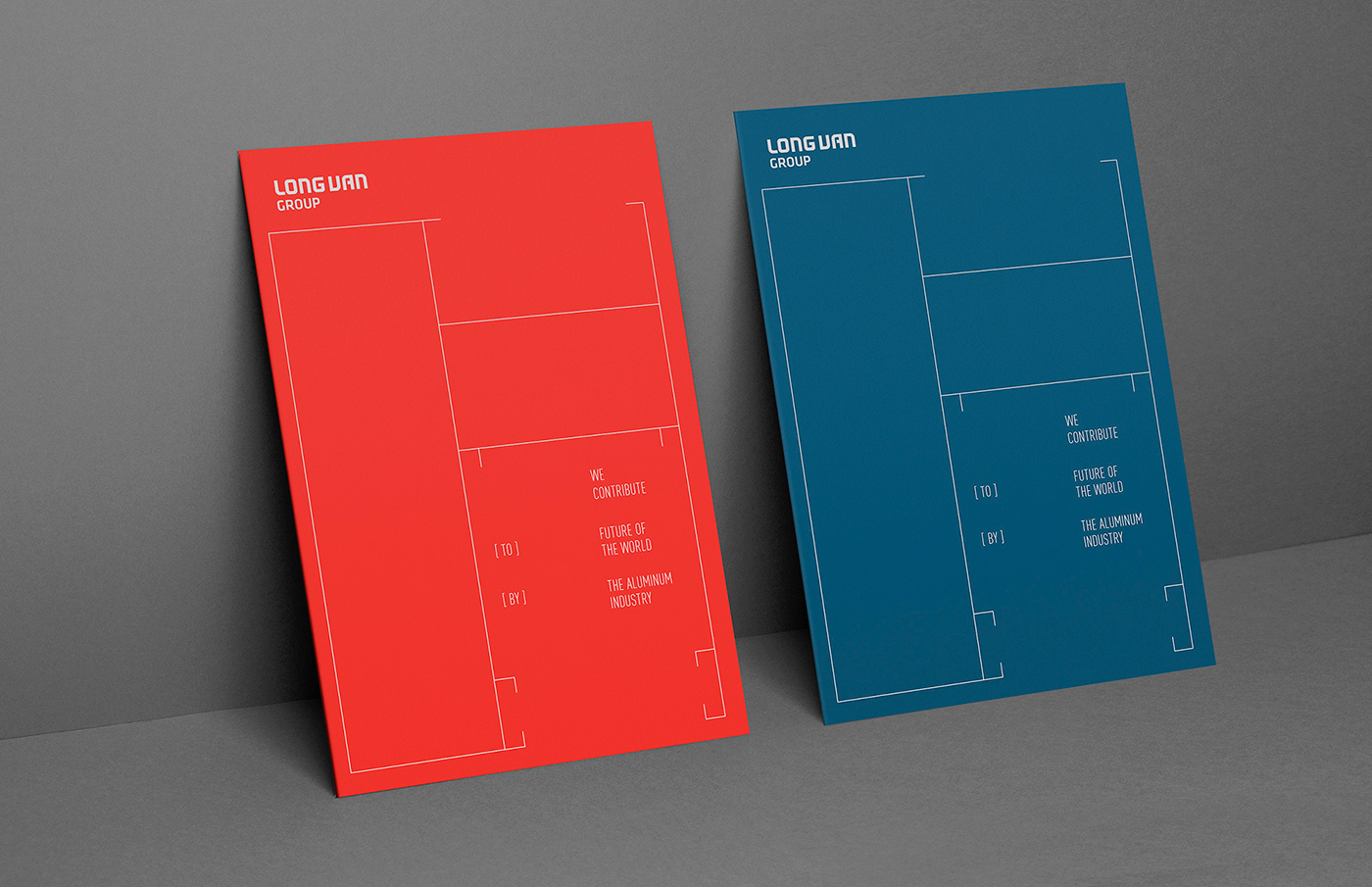
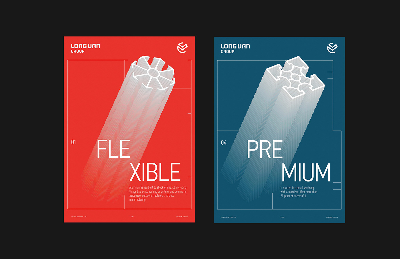
The new logomark is distinctive, simple, and flexible in use. Meanwhile, Wordmark follows the Eastern Philosophy of “Hard and Soft”. “Hard” symbolizes rigid, upright, and reliable characteristics while “Soft” stands for lightness, flexibility, and clear vision in business. The brand color palette maintains a strong contrast, giving an attractive yet simple impression. Harmony and trust are delivered well with the Blue color. Besides, Red is passionate and steady.
The new logomark is distinctive, simple, and flexible in use. Meanwhile, Wordmark follows the Eastern Philosophy of “Hard and Soft”. “Hard” symbolizes rigid, upright, and reliable characteristics while “Soft” stands for lightness, flexibility, and clear vision in business. The brand color palette maintains a strong contrast, giving an attractive yet simple impression. Harmony and trust are delivered well with the Blue color. Besides, Red is passionate and steady.


KEY VISUAL & DESIGN SYSTEM
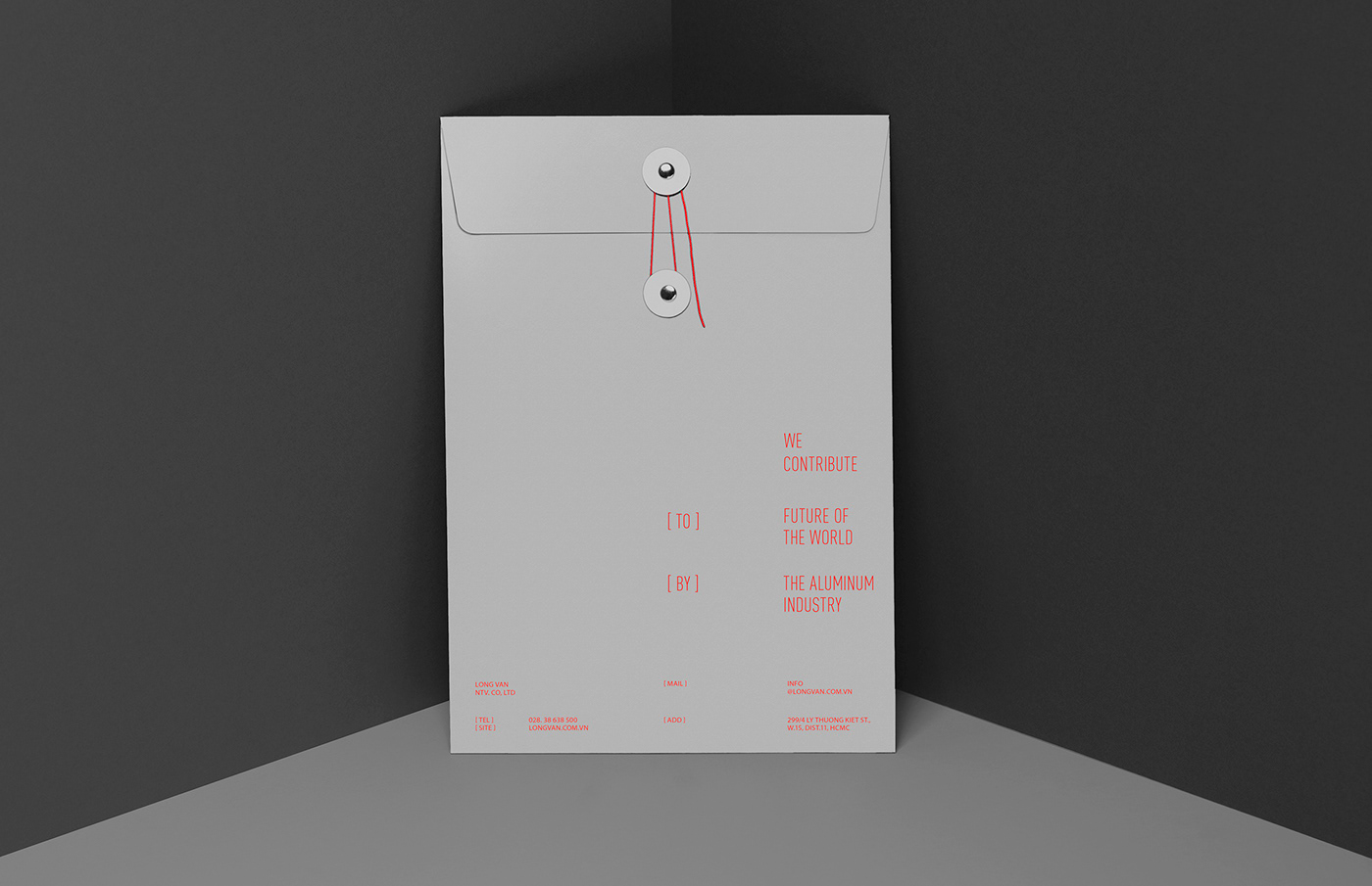
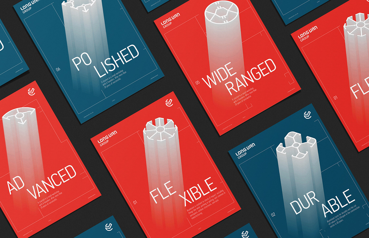
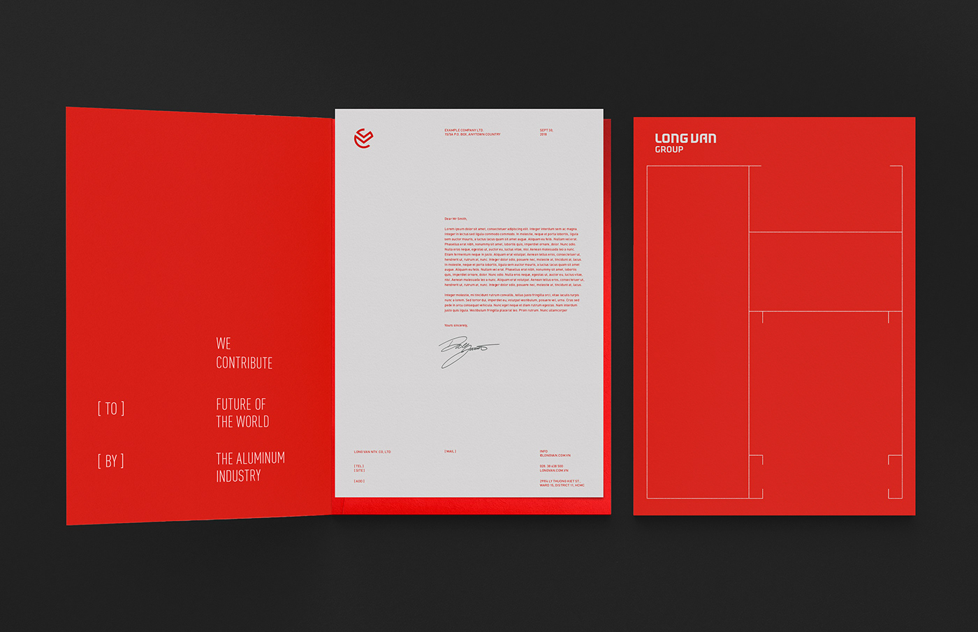
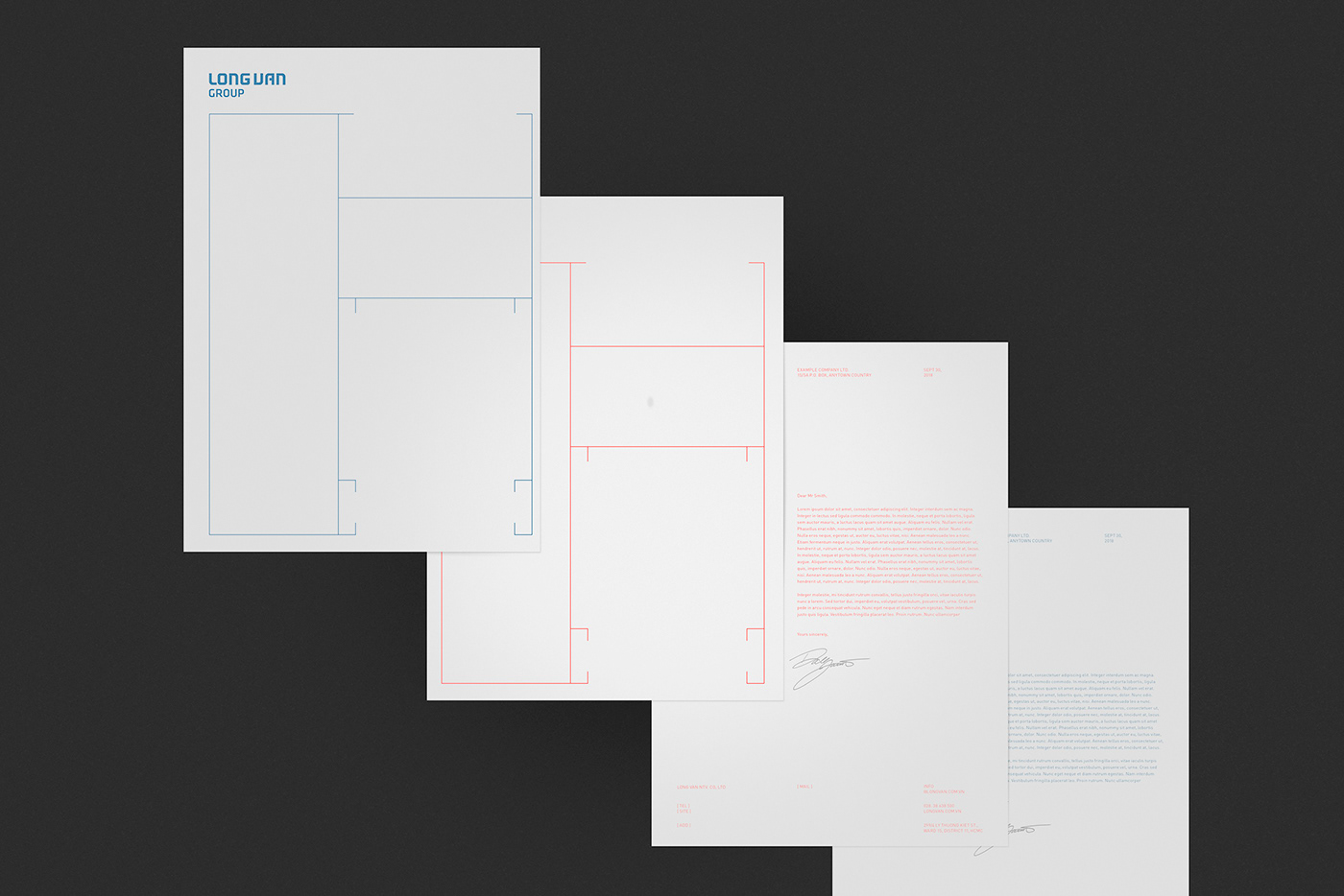
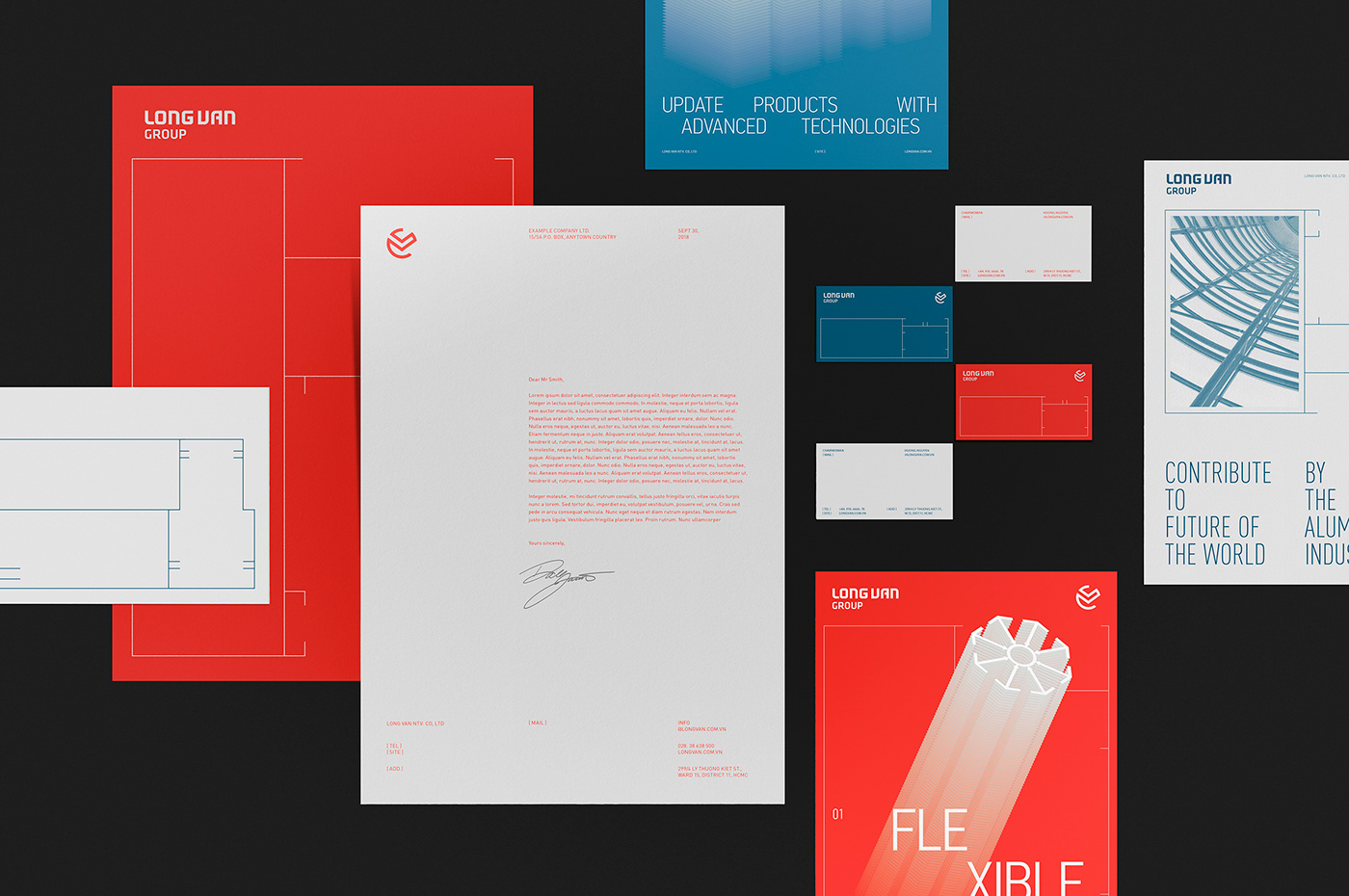
To strengthen the visual identity, we keep the stationery, marketing collateral, and website consistent and robust in the visual language and design. The frame joints of Aluminum, Long Van main products are stylized to become the border defining the typesetting and maximizing the grid use. The modern typography style paired with the blend effect implies the fast development of the brand and how it builds up the future world.